

My favourite creations for the year.
I hope you'll also post all your favourite projects for 2024 and share a link in the comments below.

JANUARY - Ruff Day

FEBRUARY - Seasonal Gate set

MARCH - Cosmos

APRIL - Kingfisher

MAY - Jurassic Joy

JUNE - Teatime Favourites

JULY - Hello Cupcake

AUGUST - Butterfly House
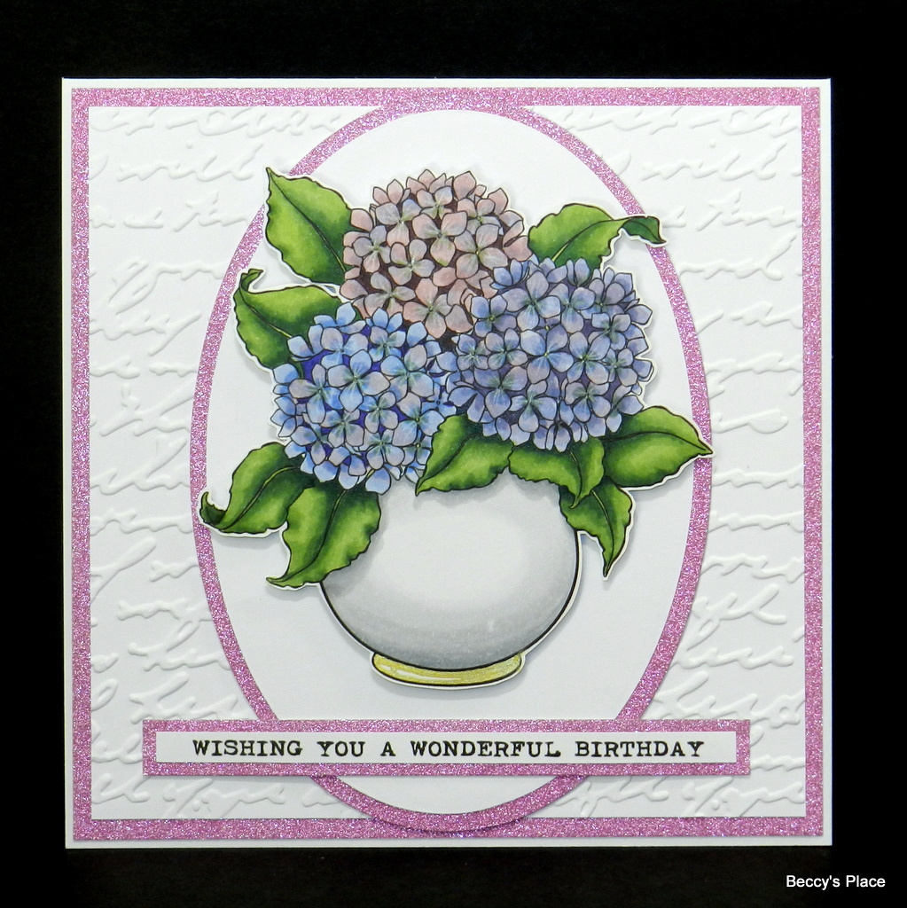
SEPTEMBER - Timeless Florals

OCTOBER - Nicholas Claus

NOVEMBER - Snugglin' Weather

DECEMBER - Christmas Puddings


