Showing posts with label christmas tree. Show all posts

Sunday, December 22

Candy Cane Christmas

I coloured the candy cane tree in shades of light grey and red, then teamed it up with some shiny gold cardstock and a red embossed panel. Simple, but festive!


Products:

Tuesday, December 17

Triangle Slimline Card

This Christmas Tree image was the perfect shape for creating a long, thin triangle-shaped card. I printed the digital stamp at 14cm high, coloured with alcohol markers, cut a large triangle around it, then added it to a custom card base.


Products:
 

Monday, December 9

Bright and Cheerful

Sometimes it's nice to get away from the "traditional" Christmas colours and use something a little different, like all the bright shades of the rainbow! I've coloured the stitched tree from the new Christmas Trees set with alcohol markers then added patterns over the top of each section using a white gel pen. I think the effect looks like patchwork. 


Products:

Friday, November 8

Day 8 - Change Colours

Have you been patiently waiting for the first non-alphabet prompt? Well, today's the day!
I want you to create at least two cards using the same image and the same layout but with a different colour arrangement. You can switch the location of the colours, as I've done, or you can completely change the palette.


YOUR TURN: Create at least two cards with different colour arrangements.
Click the link below to add a photo of your creation to the challenge:

Digital Stamps:

Tuesday, November 22

Day 22 - "T"

"T" is for Christmas Tree, often the centrepiece of our holiday decorating and a point of gathering early on Christmas morning. I've included a little colouring tutorial below to show you how I colour pine trees to get a great three dimensional look.


YOUR TURN: Create a card using the letter "T" as your prompt.
Click the link below to add a photo of your creation to the challenge:

INSPIRATION WORDS:
Three Wise Men, twinkle, turkey, tidings, tinsel, toys, tree, trimmings, teal, turquoise, tutorial, techniques, tent card, tilt card, tri-fold card, two-fer cards

Stamps:


Colouring a great looking Christmas tree comes down to getting an obvious contrast between the light and dark areas. The dark colours will recede, creating the illusion of depth, as if the branches are disappearing back into the tree toward the trunk. The light areas will pop forward, making the tips of the branches appear much closer to the viewer and tricking the eye into believing it's seeing dimension. Sound confusing? Let me show you how simple it is in practise...


Start with the dark areas. I'm using green copic markers - G29, YG67, YG17 and YG25. There's a good range of tones across these four markers, from the deep pine green of G29 to the warm yellow green of YG25.
Have a look at the image. You'll notice there are little branches within the tree represented by jagged, pointy lines. The tips of the points will be the lightest part of the branch since they are the ones that are extending out of the tree. On the other side of those same lines will be the darker areas, and that's where you want to start with your darkest marker.


Now colour over the dark marker with the YG67, bringing the lighter colour a little bit further. This will help to blend the colours while also creating the transition between light and dark. Remember to keep those pointy tips blank for now.


Repeat the process again, this time using the YG17. You'll only have a little big of blank space left at the end of the branches, which is more than enough to create that illusion of depth.


Complete the branches with the YG25, remembering to colour a little over the previous colours to help with blending.


Since you really don't need ultra smooth blending, it's fine to colour the entire tree at one time, which is how I usually do it. Add all your dark green first, then come back and add the other colours one at a time.


Don't worry too much about the colours not blending together smoothly, the effect is better when you have a stark difference between dark and light. Take a close look at my colouring... you can see the definite change between each of the four colours, rather than a smooth blend.


Time to colour the ribbon. I'm decorating this tree with cool blues and violets, so my shadow colour is BV04. I've applied it using little flicking strokes, which have a jagged sort of edge and help to give a much smoother blend to the finished image. 


The next marker is BV13. Again, start by colouring over the darker ink and flicking a little further out. You want to leave just a little bit of white space where the ribbon would naturally curve outward, that would be the position of the highlight.


Blend the ribbon with the BV02, filling in the remaining white space.


Colour the baubles using three tones of blue - I chose B16, B14 and B12. As you can see from the photo below, I added the darkest colour around the entire bauble, adding a little more under any overhanging branches, on the right hand side and underneath each bauble.


Blend the B14 into the B16, bringing it a little further in until you're left with just a small white space in the upper left quarter of the bauble. There's no need to be overly particular about the size or location of the highlight, but do try to keep it in the same basic area.


Finish each bauble by blending with the B12. That means adding the colour to the white area and also over-colouring some of the B14 and B16. (If you wish, you can add a little white dot with a gel pen to each of the baubles for a very high shine).


Since I wanted a silver star on this tree, I added a cool grey "glow" around the outside of the star by blending from a C3, which was right up against the outer edges of the star, through to C2, C1 and C0. With each application of grey, I gently altered the shape of the "glow" so that it went from a star to a circle by the time I was adding the final colour.


The last step was to fill in the star with a silver metallic gel pen. 


Done!

Monday, November 23

Day 23 - "T"

It's all about the tree.

YOUR TURN: Create a card using the letter "T" as your prompt.
Click the link below to add a photo of your creation to the challenge:

INSPIRATION WORDS:
Three Wise Men, twinkle, turkey, tidings, tinsel, toys, tree, trimmings, teal, turquoise, tutorial, techniques, tent card, tilt card, tri-fold card, two-fer cards

Stamps:

Sunday, November 17

Day 17 - "O"

It was a toss up between ornaments and one layer for today's prompt.
I decided to settle the matter by using both!


YOUR TURN: Create a card or papercraft project using the letter "O" as your prompt.
Click the link below to add your creation to the challenge:

INSPIRATION WORDS:
ornaments, over the edge cards, oval cards, one layer, origami, outdoor, Our Lord, orange, ochre, onyx

STAMPS:

Friday, October 25

Trim The Tree


Trimming the tree is one of those wonderful holiday traditions that many households enjoy together, and as such, it's also a popular image for holiday cards. Today I want to show you one way of colouring and decorating a Christmas tree image for your cards, scrapbook pages, art journals and paper craft projects.

I've printed a digital image in light grey by using the "washout" feature in Microsoft Word. The lighter lines will allow me to add more colour, rather than solid black lines, and results in a finished piece that looks more like a painting or drawing rather than a stamped image. Since I'm planning to use alcohol markers, I've printed on a piece of blending card.

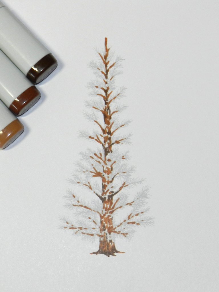
Start by colouring the trunk and branches of the tree. You want to use a few shades of brown to give a little bit of depth and interest, but there's no need to worry too much as the pine needles and decorations will cover most of it. As you can see, I've left a lot of white space in my colouring so I can layer the green over the brown. Alcohol markers are transparent and lower layers will show through whatever you apply over the top. To give the impression that some of the pine needles are actually in front of the trunk, you need to make sure the brown isn't showing through.

Add the pine needles with small strokes from the very tip of the marker.

Fill in as much or as little as you like.

Add a little bit of light green to the tips of the branches where new needles would grow.

Once the colouring is done, it's time to decorate!

I love using different mediums to add dimension, colour and texture over the top of the image. I've found some mediums are better than others at holding their shape, but it's good to mix it up with different brands. Don't forget you can also add rhinestones and self adhesive pearls. If your image is large enough, you can even think about die cuts and small stamped baubles. Have fun!

Stamps:

Wednesday, October 23

Christmas At Judy's Place


Judy has used a non-traditional colour scheme to create an amazingly beautiful Christmas card collection that is sure to delight whoever is lucky enough to receive one. Pinks, blues and purples coordinate perfectly with the cool green she has used for the tree. Some silver and purple glitter paper, sparkling rhinestones and fabulous layered snowflakes finish her collection perfectly.


The first card is a side step fold that allows for extra dimension to place embellishments, images and other little adornments. Judy's second card features lots of fussy cutting to help define the image against the background.


Judy has very kindly provided a colour chart of the pencils she used to colour both cards. Don't forget to stop by her blog to see what else she has been creating, you're sure to be inspired!