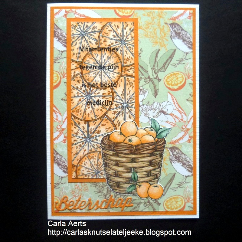
Carla has created two beautiful cards inspired by nature and the changing of the seasons. She embellished the image panels from our new Card Panels 1 set and layered them onto beautiful coordinating backgrounds.
Showing posts with label Card Panels 1. Show all posts
Friday, May 26
Saturday, May 20
Panels
Using the pre-coloured digital image made this card super quick and easy to create, and the narrow strips meant that I could use up some of the cardstock offcuts that accumulate so quickly in my drawer!
Stamps:
Wednesday, May 17
Card Collection
Anesha has created a gorgeous collection of cards using the new Card Panels set of digital stamps. She combined rich, warm tones with shades of orange, yellow and green cardstock to bring a decidedly autumn feel to her first card, which was embellished with beautiful die cut ivy. She went on to create a set of four goldfish cards that would be suitable for a wide variety of occasions. Three of them feature the pre-coloured image from the set, and the fourth was coloured by Anesha using orange and yellow markers.
Labels:
Anesha Marshall,
Card Panels 1,
design team cards,
fish
Monday, May 15
Simple Squares
You don't always have to use an image in its entirety to create fantastic cards. Today I'm going to show you a fun technique using two pre-coloured citrus panels, some coordinating cardstock and a couple of square punches.
I used a 1" punch to cut squares from the two pre-coloured panels I printed. Make sure you print the image large enough to accommodate the numbers of squares you wish to work with. The panels I printed are 51/2" tall, which allowed me to punch 10 squares from each one if I kept the cuts close together.
I used another square punch with a decorative edge to punch mats for each of the image squares, then layered them together.
I adhered a piece of scrap chipboard to the back of each tile for some added dimension.
It's important to place the first tile as accurately as possible on your card as this will be the foundation piece for the remaining squares. As you can see from the photo, I took advantage of the horizontal lines on a clear ruler to make sure my first tile was straight and equidistant from the top and side of the card base.
If you feel confident enough, place the remaining tiles by sight. Feel free to continue using the ruler if you aren't confident that your squares will end up in a nice straight line.
Secure the first and last tile in the second column to give yourself a guide for the placement of the remaining squares. Keep them lined up with the top and bottom as well as the tiles in the first column.
Cut away any excess cardstock from your base, then finish the project with a sentiment.
The second card I created has the tiles placed on an angle so they look like diamonds. I cut four diagonally in half to fit each side and complete the square. Although the effect is fabulous, the process was really quite difficult without guide lines for placement. If I were to do it again, I would probably add score lines as both a design element and a guide.
Stamps:
Wednesday, May 10
Goldfish Panels
Today we're doing a mixed media project. Now before you scroll by, there's not a lick of paint, paste, chipboard, wax, or inky spray. "Mixed media" just means a number of different colouring or art mediums used on one project, and in our case, that will be water based inks (Distress Ink cubes), alcohol markers (Copics) and coloured pencils (Prismacolor)... nothing scary at all!
I printed the goldfish panel onto blending card with light grey ink, which will give me a no-line look once I've finished the colouring. I also collected three shades of blue distress ink, which I will brush into the background, a collection of orange, yellow and red markers for my fish, and a white, grey and black pencil for added highlights and shadows.
Brush or blend the water-based ink onto your panel, directly over the fish. Spritz lightly with water and immediately place a paper towel over the top to absorb the water. This will leave tiny white dots that resemble little bubbles.
Now spritz again with water, but this time allow the card to air dry rather than using a paper towel. This will leave watery rings of colour.
Once your card is completely dry, start colouring the fish with alcohol markers. Since there are "layers" of fish, you'll want to have several different colours so that each one is discernible. I have some orange fish, some red fish and some that are yellow.
Use a black, fine point pen to add some detail to the eyes of the fish.
Here they are all coloured.
Now use your coloured pencils to deepen shadow areas and lighten the highlights. This will help bring back some of the detail that may have been lost during the colouring process as well as give the image depth. Don't forget to add a dot of bright white to each eye to really bring them to life!
Highlights:
Shadows:
Repeat for all the fish in your project. You can even add tiny scales using the white pencil, but try to keep it to the uppermost fish to boost the illusion of depth.
Stamps:
Sunday, May 7
Citrus Goodness
Zesty lemons and limes mixed with sweet slices of orange are a fresh and fabulous way to decorate a greeting card, especially when you add a layer of sparkly glitter to really make things pop!
Labels:
Card Panels 1,
Deanne Saunders,
design team cards,
lemons,
oranges
Thursday, May 4
Boost Those Shadows
A great way to add extra dimension to an image is to beef-up the shadows, especially when there are layers of objects, such as these leaves. Adding darker shadows tricks the eye into seeing depth... the darker the area, the more recessed it appears.
I started by printing a coloured version of the leaf panel and selecting a variety of mid to dark grey markers. I'll use the lighter shades on the leaves at the top and darker shades in the leaves that are deeper in the pile.
The uppermost leaf is where I'll begin to deepen the shadows, using the lightest of the grey markers (a copic W4). I'm only going to add the shadow around the right hand side and bottom of the image, not the entire outline. This will instantly "lift" the leaf away from the pile.
I'll apply the next darkest marker (W5) to the next layer of leaves, which I'm indicating in the photo below. Again, I'm only applying the shadow around the right and bottom of each leaf. None of the marker should cross the uppermost leaf or you'll lose the illusion.
Continue working down the layers until you've applied the darkest marker to the bottom leaves in the pile. Those dark areas will pull backward, giving the illusion of depth.
Here you can see the difference between the image we boosted and an untouched version.
Stamps:
Monday, May 1
New Releases
New Digital Stamps
For The Birds
digital stamps
Card Panels 1
digital stamps
Labels:
Card Panels 1,
digital stamps,
For The Birds,
new release
Subscribe to:
Posts (Atom)