Showing posts with label distress inks. Show all posts

Sunday, December 17

Tutorial - Adding a Garden


Today I want to show you how to create a simple background for your silhouette images by using a combination of water-based inks, alcohol markers and a fine line pen. Since the inks and markers have a different base - water vs. alcohol - they can be layered without smudging or bleeding together.


1. Start by selecting a few base colours to ink the background. I've chosen a couple of greens, a pretty pink and a light blue for the sky. You'll also need blending brushes or daubers, and, of course, a printed silhouette image.


2. Blend some of the darker green into the base of the image. Don't worry about making it smooth and consistent, a few blotches will add to the effect.


3. Now blend some of the brighter green above the first layer of colour. (If you don't have another green, just continue with your first colour)


4. Bring in some blue for the sky.


5. Add some patches of pink here and there. This will be the basis for your flowers.


6. Use a fine line pen to create long blades of grass. These are formed with simple, slightly curved strokes. Remember not to have them all facing in the same direction, and you also want to vary the length and placement. There's no need to fill in the entire area, just have little "patches" here and there.


7. At the base of each patch of grass, add some tiny, broken, horizontal lines and various sized dots to simulate soil and pebbles. This will also give the impression of little shadows.


8. Now "blob" in some flowers with a pink alcohol marker. Don't spend a lot of time trying to draw realistic petals... five or six blobs of colour in a loose circle is all you need, and there's no need to complete every circle. Bunch your flowers together, and again, vary the sizes, shapes and distances between flowers.


9. Add in some tiny leaves and a few thin stems with a green marker.
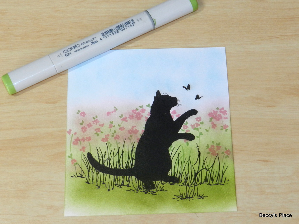

10. Add some more pen lines around your flowers, leaves and stems. Don't outline every flower and keep the lines broken and inconsistent.


11. Using warm grey tones, add in some shadows beneath the image and around the base of each patch of grass. Start with a dark grey and blend it down the page with a few lighter tones.


Digital Stamps:

Thursday, November 2

Day 2 - "B"

I've coloured this golden bell with distress inks and a watercolour brush, using a technique I like to call "slap happy watercolour". As the name implies, I simply slap on the colour with little concern for staying inside the lines or worrying about mixing paint. Once dry, I add a second layer for some shadows and shaping.


YOUR TURN: Create a card using the letter "B" as your prompt.
Click on the link below to add your project to the challenge:

INSPIRATION WORDS:
Blitzen, boots, bows, box cards, bendy cards, building block cards, bleaching, beads, brads, burnishing, blue, brown, black, baubles

Stamps:

Thursday, April 14

Tutorial - Reef Travellers Card


In this tutorial, I'm going to show you how to create a card with a script background using all the sentiments from the Reef Travellers clear stamp set. You can recreate this card with whatever stamps you have at home, but they do need to be the same height and cut so they can be placed close together.


1. You'll need three water-based ink pads, some blending brushes or daubers, a piece of smooth cardstock, sentiment and images stamps and a spritz bottle filled with water. I'm using Evergreen Bough, Dusty Concord and Faded Jeans Distress Ink cubes and a piece of Bristol paper, which I find allows for smooth blending.


2. Brush the colours onto the cardstock, adding each colour in two or three places. Make sure you blend the colours together rather than leaving gaps between each.


3. Add a spritz of water over the top of the ink. To get a nice fine mist, hold the water bottle up high and mist just one time. Immediately apply a paper towel to soak up the water and lift the ink, which will result in tiny white spots across the surface of the cardstock. If you prefer a more subtle effect, leave the water on the paper to dry.


4. Lay all the sentiment stamps close together on an acrylic block taking care to line them up horizontally. Stamp on a piece of scrap paper and adjust the position of the stamps until they are all parallel. (NOTE: To help get the stamps nice and close, I used a pair of small, sharp scissors to cut away some of the extra polymer around the words. This won't harm the stamp as long as you do not cut through any of the raised stamping areas)


5. Use the lightest of the inks to stamp the words. If your inks are all very dark, consider stamping off the first layer of ink on a piece of scrap paper and using the second generation impression. I used the Evergreen Bough, which is considerably lighter than either the Dusty Concorde or the Faded Jeans.


6. Start the stamping at the top of the cardstock, allowing some of the image to protrude off the top and side edges. Continue stamping down the left side of the cardstock until you reach the bottom. Remember to move the stamp between impressions so that you don't end up with a tiled look.


7. Choose one of the sentiments and stamp in one of the darker colours. I positioned my sentiment at the bottom, right hand side of the card.


8. Now use the final colour to stamp two or three of the turtles. I allowed one of the images to protrude over the edge of the card. This gives the impression of continuity - the scene continues outside of the four sides of the cardstock.


9. To give the turtles some dimension I'm adding a shadow with alcohol markers. The alcohol won't interact with the water so I don't have to worry about smudging or smearing the colours I laid down earlier. I'm using a cool grey (C4) and softening it with a blender (0).


10. Add the grey to the right hand side and bottom of the images. Leave the top and left hand side plain to give the image depth. Once you've added the grey, use the blender pen to soften the shadow by swiping over the hard edge once or twice.


11. If desired, trim your card to fit the base. This will also tidy any inky or blotchy edges.


12. Choose a matching card base and attach your stamped cardstock. The colour you choose for the base will bring out the matching colour in your card. For example, the purple I chose for my base really brings out the purple ink I brushed into the background, and similarly, the card I created with the blue base brings out the images stamped in the same colour.


Stamps:

Monday, November 16

Day 16 - "N"

My inspiration for today's "N" challenge is Northern Lights, also known as the Aurora Borealis, a phenomenon that I'd love to see in person. Interestingly, there are also southern lights that are visible from New Zealand and southern parts of Australia called the Aurora Australis. 


YOUR TURN: Create a card or papercraft project using the letter "N" as your prompt.
Click on the link below to add a photo of your creation to the challenge:

INSPIRATION WORDS:
North Pole, noel, nativity, naughty, nice, nutcracker, northern lights, no-line colouring, napkin fold, never ending card, naples yellow, navy, neon

Stamps: