One of the nice things about digital images is the ability to enlarge the design so that just a portion of it can be used for a card or layout. Although you can also do this technique with traditional stamping, oftentimes the stamps are too small to leave out large sections without throwing out the sizing.
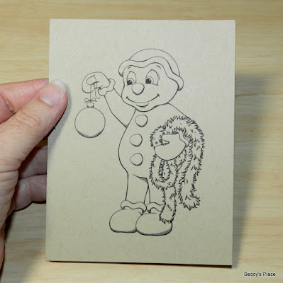
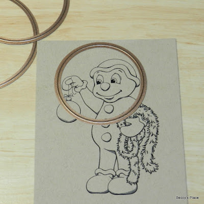
I enlarged one of the gingerbread men from the Gingerbread Season digital set and printed him onto a piece of kraft cardstock. I spent some time deciding on how much of the stamp I wished to keep and chose a circle die to create an appropriately sized window or frame.
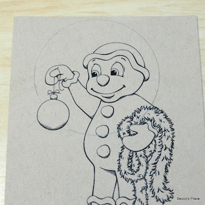
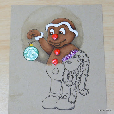
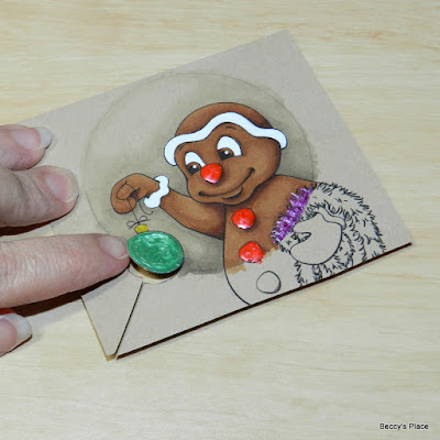
Tracing around the outside of the die with a pencil gives me a guide for colouring. As you can see, I didn't draw over the bauble, as I want that to remain a part of the design.
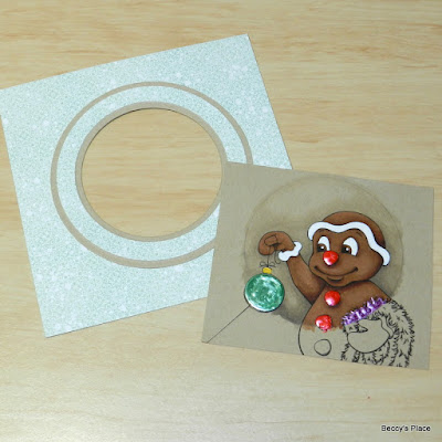
Since I plan to "frame" the image, I cut away the unused, bottom section. I also cut 3/4 of the way around the bauble so that it can be placed on the outside of the frame.
I created a frame from cardstock and patterned paper, sizing it just a little smaller than my card blank.
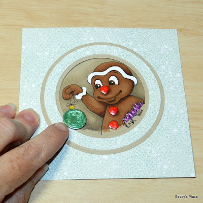
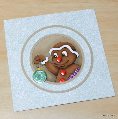
Before I secure the image I need to make sure the bauble hangs outside the frame by lifting it slightly and sliding it into place. Then all that's left is to glue it to the front of the card and add a sentiment.
Stamps:



14 comments:
Thats so cool love cropping images to highlight area ie faces
I agree! Digital stamps are wonderful for creating your own masterpieces. LoL xx
Beautiful coloring! It's like the gingerbread man is coming out of the circle.
This is very cool. Thanks for the tutorial.
Wat een duidelijke uitleg en wat mooi gekleurd zeg!!
So sweet this gingerbread boy peeping through the circle ! Love the glittering bauble ! Creative regards, Gina
He's soo cute, love how you've put him in the circle and that you placed the ball over the edge! Great coloring, love his tan :) and the craft circles make him pop out of the circle!!
So pretty and beautifully x
Awesome technique! Love the results.
So VERY Beautiful Beccy, love the bauble out of the frame.
Faith x
Love how the ornament is hanging outside of the frame.
Marianne x
Cute! I especially like how you did the ornament. Thank you for the tutorial.
Well done, Beccy...thanks for sharing the tip.
Great looking card
CUTENESS GALORE :)
LOVE your colouring and design, the ornament popping through the window is the perfect finishing touch!
Post a Comment