Tuesday, August 30

Two For One

One of my favourite techniques is to print a large image, colour it, and then cut it in half or in four to create several cards with partial images. Although you probably colour just as much as you would with two complete cards, the image is a lot bigger and easier to negotiate since there are no tiny spaces.


I printed the water lily image at 5" tall on regular, smooth cardstock that I purchased from an office supply store, then coloured with Prismacolor pencils. I kept the cards simple with matching purple mats to frame the image panels and a scattering of liquid pearl drops.


Stamps:

Monday, August 29

Little one

My favourite character from the Big Love set is this cute little platypus with his hands crossed over his tummy. Although I'm not sure you'll find a lot of blue platypus in the wild, I do love the combination of blue and brown and intend to send this to a sweet little boy for his first birthday.


Stamps:

Saturday, August 27

Beautiful Days


Pretty painted flowers, vellum overlays, printed backgrounds and scattered sequins are some of the features of these two beautiful cards created by Cynthia using the Hello Lovely set of digital stamps. She has added lots of wonderful texture to her creations using bold brush strokes, textiles and torn paper, which all contrast beautifully with the delicate waterlily blossoms.


Thursday, August 25


Selected, retired digital stamps at an incredibly low price for just 48 hours.
No rainchecks. No repeats.

Rose Bouquet
digital stamps

Tuesday, August 23

Tutorial - Z-Fold Box Card


Z-Fold Box Cards are constructed with a loose concertina section in the centre that allows you to build fabulous three dimensional scenes right inside the card. They fold flat for postage - as every good card should - and can easily be adjusted for size. 


TEMPLATE:

1. You'll need one piece of cardstock measuring 111/2" x 41/4", one piece measuring 111/2" x 11/2" and one piece measuring 111/2" x 2".


2. Place the 111/2" x 41/4" piece of cardstock horizontally on your score board and score at 27/8" and 53/4". Fold along each score line, starting with a mountain fold then a valley fold. This will form your card base.


3. Place the 111/2" x 11/2" piece of cardstock horizontally on your score board and score at 27/8" and 53/4". Fold along each score line, starting with a valley fold then a mountain fold. Rotate this piece of cardstock 180 degrees so the long section is now on the left side. These two pieces form the card base.


4. If you wish to add a decorative edge to the cardstock, now's the time to do it. I used a "grass" die to add edges to both of the narrower pieces of cardstock for an outdoorsy look.


5. Flip the 111/2" x 11/2" piece of cardstock over so that the front is facing down. Add adhesive to the right hand section and adhere to the far right hand side of the 111/2" x 41/4" piece of cardstock.


6. Stretch the narrower piece of cardstock all the way across the wider piece. They should be the same length. Turn both pieces over so they are face down on the desk. Fold back the right hand panel of the wider piece of cardstock and apply adhesive to the piece of narrow cardstock that is showing. Press the wider panel back down over the adhesive to secure the two pieces of cardstock together. (See the photos below.)


7. Place the remaining piece of cardstock on your score board and score at 1/2", 33/8", 37/8", 63/4", 71/4", 101/8" and 105/8". Trim away the excess cardstock after the final score line so that you have a 1/2" tab at each end.


8. Fold along the score lines to create a loose concertina, which should fit comfortably in the "box" section in the centre of the card.


9. Your concertina section needs to be secured inside the box. The easiest way to do this is by folding up the concertina as shown below. The tab should be folded down. Add adhesive to the tab and to the last 1/2" section of the folded piece. See the photos below.


10. Turn the concertina over so the glue is facing downward. Place it under the narrow piece of cardstock you adhered to your card base earlier, positioning it centrally and keeping the bottoms flush.


11. The concertina will be secured to one side of your card base. Now add adhesive to the same sections at the other end of the concertina and press the card flat again. This should secure the concertina in place.


12. Time to decorate! I've used all five of the little animals from the Big Love set of digital stamps, printed in colour and fussy cut. I also cut out some fluffy white clouds and die cut some tiny flowers to scatter throughout the card. Remember when you're decorating that the card will be seen from two angles... closed and fully open on display, so take care to decorate accordingly.


Stamps:

Sunday, August 21

Anesha's Little Cuties


Anesha has created two adorable baby cards using the new Big Love set of digital stamps. She coloured two of the baby animals with pencils, leaving lots of wonderful texture to give the impression of fur and soft feathers. A blue halo around the top of the animals and deep grey shadows beneath, help to ground the images and create the illusion of physical space.


Friday, August 19

Tutorial - White on Blue


Colouring with a white pencil on a dark background produces a striking result that has an almost ghostly feel. The idea is to colour the highlights and use the dark background to form the shadows and recesses of the image, which is basically the reverse of how we normally colour.


Start by printing or stamping an image onto a smooth piece of dark coloured cardstock. Since we'll be using pencil, it doesn't really matter what ink you choose, but you do want it to be completely dry before you start colouring. I'm using a white, Prismacolor pencil, which is lovely and soft and will give me a good range of shades. Artist quality pencils tend to be softer allowing you to add more pigment than a hard pencil, so always purchase the best brand you can afford.


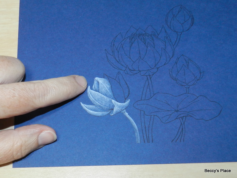
Work through the image one section at a time and always start on the opposite side to your dominant hand. For example, I'm right-handed and will therefore start colouring over on the left side of the image so that I'm not constantly dragging my hand over coloured areas as I work.


The method I use to colour is always the same for this technique - lay down a VERY LIGHT layer of pencil (photo above), go back and mark the highlight (photo below), in this case the edge of the petal, then soften the edges with more pigment (two photos down).


As you can see, I'm colouring one section at a time to make sure I distinguish all the different parts of the flower... you don't want to end up with a vague white shape.

Light layer of colour

Mark the highlight

Soften the edges.

Light layer of colour, mark the highlight, soften the edges.


Continue using the same method for all the different parts of the image, including the stems, buds, stamens and leaves. Light layer of colour - mark the highlight - soften the edges.


The darkest areas of the image will be under the petals or beneath the leaves. To keep these areas dark, add less pencil allowing the dark cardstock to show through. You don't want a sharp line between the highlight and the shadow when it's on the same section, such as a single petal, so make sure you work the pencil from the highlight area to the shadow area releasing the amount of pressure as you go. Pressing hard on the pencil will leave more pigment, forming those areas of light, and releasing the pressure so that the pencil is barely touching the surface of the paper will allow more of the background to come through.


Once you've completed a full section of the image, such as the flower below, take a moment to look at it as a whole and determine whether it needs additional pigment. Lighter areas will come forward and darker areas will recede, so you can "shape" the image by using light and dark.
I thought the left side of my flower needed a little more light, particularly the large petal I'm pointing to. By adding a circular spot of colour on the wide section of the petal, it will take on a rounded appearance. Just remember not to leave hard lines or it will look more like a polka dot!


The individual stamens are coloured using the same method as the petals - light layer of colour, mark the highlight, soften the edges.


Once the flower is complete, remember to check for areas that need a little more pigment.


Colour each of the flower buds in the same way remembering to take advantage of the dark background for shadows and contours.


The leaf is one large area of colour but we still want to add some shape by using what we know about light (comes forward) and dark (recedes) areas. As usual, add a light layer of colour to the entire leaf then mark the highlights. As you can see in the photo below, I traced around the edge of the image adding more pigment to the lines as they came up and less as they went down. This gives me a guide to which areas of the leaf will be light and which will be dark.


The leaf is a circle with the centre acting as a kind of hub, so the easiest way to colour this shape of leaf is in "wedges". However, don't keep them all the same width and resist the temptation to make them even or you'll end up with a pizza rather than a nice lily pad.


Colour the highlights in wedge shapes tapering the colour as you reach the middle. Some wedges will be narrow and high, while others will be quite wide and flat. Try to vary the intensity of colour you add to each highlighted area. You want some to seem very bright while others are less so.


Spend some time practicing with your pencils, particularly the technique of working from light to dark and vice versa. Having control over the pencil is very important for colouring as it allows you to work through a range of shades and highlights and makes shaping the image much easier.


Stamps: