Thursday, June 30


Selected, retired digital stamps at an incredibly low price for just 48 hours.
No rainchecks. No repeats.

Wedded Bliss
digital stamps

Tuesday, June 28

Pre-Coloured Image

For the first time ever, I've included a no-line version of a coloured image in one of my digital sets. I removed the line drawing completely, not just greyed it out, leaving an image that is softer with a more painted-look.


To create this card, I printed the image onto a piece of smooth cardstock, trimmed the sides to fit my card blank then fussy cut along the bottom edge. The embossed lines were done with a score board and bone folder prior to adding the flowers.

Stamps:

Sunday, June 26

Summertime Fun


Check out these fantastic cards created by Cynthia using images and sentiments from the new Beach Bums set of digital stamps! She has coloured both images with wonderful, vibrant colours that work perfectly for summertime cards... you can almost smell the sunblock! Her second card even has a scattering of sand and starfish to add to the vibe.


Head over to Cynthia's blog to see more of her fabulous creations.
Don't forget to hit the subscribe button while you're there!


Friday, June 24

Tutorial - Book Binding Card


They're super quick, super easy and can be made in any size you like.
What's not to love about Book Binding cards?


1. Start with a card blank in whatever size and orientation you desire. The only requirement is a single fold along the spine. For the curious, my folded card measures 4" x 51/4" with the fold along the 4" side.


2. Add a second score line on the front of your card, about 1" from the centre fold. You can be flexible here too, depending on how deep a side section you want.


3. Add a valley fold along the score line.


4. Add glue or double sided tape to the area between the two score lines, on the inside of the card. Press the card closed to form a 1" side fold.


5. Time to decorate! Add a decorative panel to the 1" side fold section, taking care not to add adhesive over the score line. I added a double mat and a long, side-ways sentiment.


6. Decorate the main panel of the card as desired. Done!


Stamps:

Wednesday, June 22

Beautiful Orchids


Karin has made a wonderful circle card featuring coordinating panels of patterned paper that fit perfectly inside the circular frame. She has decorated the front with the flowers from the new Orchid set of digital stamps, while the back of the card holds a pocket with a removable tag for a sentiment or personal message. Karin's second card is an elegant, black and white creation that again features the flowers from the Orchid set of digital stamps. She has printed the coloured version in grey tones to fit with her black and white theme.


Monday, June 20

Sandy Toes


Deanne has created this fun and fabulous card using paper pieced elements for the swimsuit and surfboard. With a sprinkle of sand beneath her feet and a warm and friendly sun shining in the sky, this girl has everything she could possibly want!


Saturday, June 18

Complimentary Colours

I don't use a lot of orange in my paper crafting, but it was the perfect pop of colour to contrast with all the beautiful blues and greens I was using for today's card. Using orange on the image helped to create the focal point and draw the eye to the swimmer, and the addition of the little orange rhinestones balanced out the rest of the design.


Complimentary (or contrasting) colours are opposites on the colour wheel and generally make a bold statement when used together. One of the most common uses is at Christmastime when red and green are seen together in decorations, foods, clothing and of course, cards. The other basic combinations are yellow with purple, and blue with orange, but you can also combine tertiary colours such as yellow/orange with blue/purple.


Stamps:

Thursday, June 16

Exquisite Orchids


I'm thrilled to be sharing the first projects from our newest designer, Cynthia Olheiser. She has created these two exquisite cards using the Orchid set of digital stamps, which she has coloured perfectly in shades of blue and pink. The second card features a fabulous background of softly applied inks, spatters of colour and little pearls for a pretty shine.


Head over to Cynthia's blog to see more of her beautiful work.
Don't forget to hit the follower button while you're there!

Tuesday, June 14

Hot Tip Tuesday


Spritzing
Many papercraft techniques use water and water-based mediums to create fabulous effects on paper and card. Unfortunately, once the mediums have dried, we're often left with warped or curled paper that can be difficult to use on a project. One tip, is to lightly spritz the back of the paper first. This will give a more even amount of moisture and a better chance for the paper to dry flat.

Sunday, June 12

Colouring The Orchids


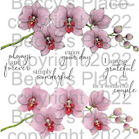
Today I want to share a colouring tutorial with you using the Orchid digital stamps, smooth cardstock and alcohol markers. I've chosen to go with yellow orchids, but you can use any colour you wish as the principals of colouring are the same.


1. I began by printing the orchid stem in a very light shade of grey, giving me a no-line look to the finished piece. You can alter the colour of the digital stamp in Microsoft Word or your favourite image editing software. If you prefer, you can print the image with the black outlines instead.


2. I like to start with the stem, or whatever is in the background, but this is just a personal preference. Add in the darkest of the greens (YG67) keeping the colour to the bottom of the stem and close to the flowers. The darker areas will recede, giving the illusion of shape and "pushing" the stem back behind the flowers.


3. Start to blend the mid colour (YG17) into the darkest green by overlapping the shades. Don't try to blend the colours completely as you want to keep some of the sudden variation and change in shade. Blend the next colour into the first two for the highlights (YG13). If you wish, you can come back in with the first green to darken the shadow areas.


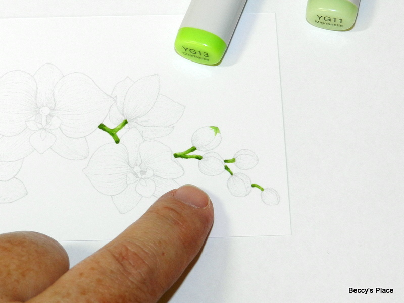
4. Time to work on the little buds. I added a nice bright green (YG13) to the very tip of the bud, then blended in a lighter green (YG11) working from the tip, over the bright green and toward the base.


5. Now I'm adding a mid yellow (Y15) to the base of the bud, which will be the darkest area, and then adding two lighter shades (Y13 and Y11) as I work my way toward the green tip. The lightest yellow will come right up to the lightest green with a slight overlap. I'll use a blender pen (0) to blend the yellow and green. Alternatively, you could use either of the lighter makers to blend the colours together.


6. The flowers have several very small parts, as you can see from the photo below. The tiny tri-petal structure in the centre of the flower is really too small to do a lot of blending, so I'm only using two deep yellows (Y35 and Y38), concentrating the darkest colour closer to the base of each little petal.


7. The larger structure, also made up of three petals, is coloured with four shades of red, starting with the deepest shade (R39) that's laid around the base of the petals. Remember that the darker colours recede, giving the illusion of depth. I've used the remaining reds (R29, R27, R24) to colour the area, blending between each layer.


8. The structure that holds the red and yellow area of the flower is coloured with the two greens we used on the tips of the buds (YG13 and YG11). You want to bring the lighter green through to the base of the two large, side petals, which will be blended with the lightest yellow (Y11).


9. Time to blend all those yellows again, starting with the lightest yellow at the very base of the petal, over the green, and working out to the mid yellow (Y13 and Y15).


10. Add the two greens (YG13 and YG11) to the tip of each petal in the same way you did the buds. This will help break up all the yellow, distinguish each petal and also add interest to the coloured image. Once the tips are coloured, blend in the lightest yellow (Y11) and work back through the other yellows until you hit the mid colour again (Y13 and Y15). 


11. Add a layer of the lightest yellow (Y11) over the entire petal to help blend. Don't overwork the image though, you want to retain some of the texture from the pen strokes.


12. The remaining three petals are set further back on the flower, which means you want them to be darker. Use your darkest yellow (Y17) at the base of the petals and work through to the mid yellow again (Y18, Y15 NOTE: Y18 is actually a less intense colour than Y17)


13. Add the green tips, then complete the petals in the same way as the previous two, remembering to blend with the lightest yellow (Y11) once all the other colours have been added.


14. Adding a little shading will help distinguish the petals and layers of the flower. Take care to apply the pencil VERY lightly over the yellow. You can always add more layers of colour but it's very difficult to remove. I used a nice warm grey pencil (50% French Grey), followed by a slightly darker pencil right in close to the base (70% French Grey). If you're using cool colours for your flower, such as blue or purple, then choose a cool toned grey for the shadows.


15. Time to colour the remaining flowers.


16. And finish with some shading.


Stamps: