Showing posts with label pencils. Show all posts

Wednesday, January 15

Cut Sheets, Stamps and Dies II


Continuing on from our earlier tutorial about using the coordinating cut sheets, stamps and dies, I have another technique idea for you. This time we're going to colour over the top of the cut sheets with either pencils, which I'm using, or markers. With this technique, you can enhance, darken, or lighten the pre-coloured images, or even change them completely!


I've opted to enhance and darken the images, so I'm using pencils that are close to the same colour but darker by a few shades, plus little hints of black to deepen those shadows and create a stronger contrast.


Here they are all coloured. As you can see, the pencil leaves added texture on the paper. If you prefer a smoother finish, you can either use markers or blend out the pencil with wax or oil depending on the type of pencils you're using.


A comparison...


Here's a birthday card made with the colour-enhanced images.


Products:

Thursday, February 15

Seasonal Gates

I've coloured the Spring, Summer, and Autumn seasonal gates using a combination of alcohol markers and coloured pencils. Adding the pencil helps to bring back some of the details that get lost during the colouring process, particularly when you're completing a "no-line" project. I've included the before and after photos for each of the three images below. Now all that's left is to make them into cards...

markers only                                                          markers + pencil


Digital Stamps:

Monday, February 5

Winter Gate + timelapse

I started out with the intention of creating a monochromatic card, but as often happens, once the colouring was done I decided to transform the image into a night scene. You can see the process in the timelapse video below (the link will take you to my YouTube channel).


Here's a timelapse video of the image being coloured:

Digital Stamps:

Saturday, January 13

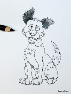
Tutorial - Colouring A Shaggy Coat


Today I want to show you how to colour the hair on a shaggy dog. In my example I've used black pencil, but you can switch it out for whatever colour you'd like your pooch to be.


1. Start by printing (or stamping) your image onto a piece of white cardstock, then begin adding the first layer of colour. It's important to colour in the direction of the hair growth, for example, the hair in his ears grows up toward the tip of the ear.


2. Now add in the darkest area of colour, which will be inside the ear. Again, make sure you follow the direction of hair growth. Keep your pencil quite sharp so that the individual strokes are visible.


3. Add more pencil strokes coming out from the darkest area. As you work outward, allow the strokes to become further apart so that "gaps" start to appear. These will naturally lighten the area.


4. As you get to the lightest area, apply less pressure to the pencil as well as keeping the strokes further apart.


5. Now apply a base layer of pencil to the face. In general, dog fur grows outward from the nose, so that's how you'll want to colour.


6. Add in the darkest areas of colour - around the eyes, which helps to sink them into the skull and prevent bulging, below the nose and around the back and bottom of the muzzle.


7. Now add in the mid strokes working through to the lightest pencil strokes at the top of the head and muzzle.


8. If you wish, you can use your black pencil to add more shading to the dark areas. You can do this in the traditional way or with short, dark lines. I've added more shading around his muzzle to help separate and distinguish it from the rest of the dog's head.


9. Add a light coat of pencil to the nose, then colour the nostrils black.


10. Shade from the bottom of the nose to about half way up, reducing the amount of pressure on the pencil so that the colour fades out. You don't want to use obvious pencil strokes on the nose as it has a smooth texture.


11. Complete the nose by shading in slightly from the top and each side. This will help to give the impression of shape. If you wish, you can add a little white pencil as a highlight.


12. Finish the dog's head by colouring his chin in the same manner as the rest of his fur.


13. Apply a layer of colour to the dog's body. (You can work in smaller stages if you prefer.) Remember to always follow the direction of the fur's growth, which is away from the head and toward the tail. The fur on the legs grows down toward the feet.


14. Add in the darkest areas and then work out toward the lighter sections.


15. Add additional shading where necessary, paying particular attention to areas that overlap.


16. Complete the image by colouring the eyes and tongue.


Digital Stamps:

Wednesday, October 19

One Layer Card


One layer cards are basically cards that have no mats, extra cardstock or patterned paper and generally, very few embellishments. The main thing to remember when creating your one layer card, is the properties of the mediums you're planning to use to colour or add interest. Since there's only one layer, you have to be careful about markers or paints seeping into the cardstock and becoming visible from the inside.


I'm using coloured pencils to colour my image. The pigment in the pencil actually sits on the surface of the cardstock rather than sinking into the fibres, guaranteeing that there will be no bleed through to the other side. I've printed the image and sentiment on a piece of kraft cardstock, which will provide a fabulous contrast for the colours, but you could use white if you'd prefer.


I start by adding a layer of white pencil to the entire image, which will help intensify the colours I add over the top. This isn't strictly necessary, but it definitely helps to keep the pigments true. Here's a little comparison I did for those who are interested: HERE


I'm using two pencils for each coloured section - a shadow colour and a mid-colour. I start by adding the shadow colour to the recessed areas of the cat's sweater. Around the neck, the fabric will be rolling away at the top, bottom and at the fold in the centre... all the places where you want to add some darkness. Feather the colour out so that you don't end up with sharp lines.


After you've applied the shadow, fill in the entire section with the mid-colour, working directly over the top to help blend the pigments together.


Repeat the process for the other colours you're using.


When colouring the front of the sweater, keep the shadows to the sides, under the collar and waistband. Don't add shadows to the centre of the cat as you don't want those areas to recede (dark colours recede and light colours come forward).


Repeat the process down each of the arms, remembering to keep the shadows to the top and bottom edges to help shape the arms.


Choose a colour for your cat. I want a little grey tabby, so I've chosen a selection of three warm greys plus black. Starting with your darkest colour, add some shading in the darkest, most recessed areas. I've added the black very sparingly to the bottom of the cat, near his tail and either side of his face, just behind his mouth.


Using the next darkest colour, work out from the shadow areas. Continue this process until you've worked through all the pencils and have the entire cat coloured.


I used the darkest grey to add some "stripes" to my tabby.


I like to add a little touch of white pen to the eyes to give them a boost and make them sparkle.


Now to work on the surroundings. I'm using several shades of French grey as well as black to add a shadow around the entire image. Focus the darkest colour under the cat, where he would be making contact with the "ground". Work around with the other pencils, slowly feathering out the colour until it's soft and barely noticeable.


If you like, you can now add some embellishments,
glitters or other mediums to complete your one layer card.

Stamps: