

People use mediums in many different ways with quite different results, so today I thought I'd share my technique for colouring with pencils. I use Prismacolor pencils because I find them to be beautiful and creamy with soft pigment that covers well, however, there are a lot of other fabulous brands on the market to choose from, including Derwent and Faber Castell. If you have the opportunity to try before you buy, I highly recommend taking advantage of it.
1. I begin by adding a soft layer of my highlight colour, adding a little more pressure in the "shadow" areas to darken the pigment. In this case, I'm using "apple green" on all the leaves.

2. I then use a darker colour over the entire leaf, except for the areas where I want the highlights to be. In my case, the light source is coming from the top, left hand side, so all the lightest coloured areas will be facing the source of the light.

3. Now I add the darkest shadows with a black pencil. Use this darkest colour sparingly at first, you can always go back in later and add more... it's a lot harder to remove the pigment! Darken areas that are behind other elements or that dip down into the picture. These deep shadows will help to give your image depth.

4. To finish, I like to add a nice bright green with quite a lot of yellow in it. I think this looks like sunshine hitting the surface of the leaf.

5. The colours I used for these leaves are Black (PC935), Dark Green (PC908), Apple Green (PC912) and Chartreuse (PC989).

6. I coloured each of the other elements in the same way - highlight colour, main colour, shadow and deepest shadow. The berries were next...


7. The colours I used for the berries are Black (PC935), Crimson Red (PC924) and Poppy Red (PC922).

8. Time to colour the vines that form the wreath base. I used the same colouring process, although there are less highlights and deeper shadows on the wreath because it is "behind" all the foliage and therefore the darkest part of the image.


9. The colours I used for the wreath are Black (PC935), Dark Brown (PC946) and Sienna Brown (PC945).

10. I want the flowers to be a nice, light pink so instead of using black for my darkest shadows, I'm using a warm brown. Other than that, the process is the same.


11. The colours for the flowers are Burnt Ochre (PC943), Peach (PC939) and Light Peach (PC 927).

12. I finished by adding some bright yellow in the centre of each flower, in this case Spanish Orange (PC1003).

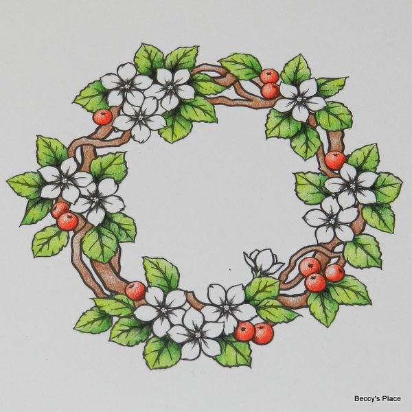
Here's the finished image, all coloured and ready to be used on a card.

Happy colouring!
Cheers,Beccy
Image: "Build A Wreath" by Beccy's Place
10 comments:
Fab! Thanks for sharing your tips x
Hi Becky, stunning coloured images thank you for sharing the process, I need to bookmark your page so I can come back again! Have a great week... Megan
Thank you Beccy - I too love my prismacolor pencils and use them a lot - your advice helps no end.
Blessings
Maxine
Thanks Beccy your tips are very useful because painting is not too much my forte, but i want to improve
Great tutorial, great colouring!
Great tutorial, great colouring!
Great tutorial and so pretty!
A great tutorial, thanks Beccy.
Carla
Beautifully colored. Thanks for sharing this tutorial.
Thanks for this tutorial Beccy !
Karin
Post a Comment