Monday, January 31

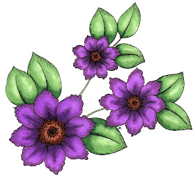
"Clematis Beccy"

Free Printable #96
Once again I have no idea what these flowers are actually supposed to represent in the "real world", I just thought they looked pretty. I think they would also be big enough to colour and cut out for those people who enjoy layering their pictures.
UPDATE: Thank you so much for all your ideas on what these flowers could be. It's fun just to read the different opinions, although in this case most of you agreed on the species... or what it kind of resembles anyway. I decided to go with GrammaR's idea of calling them Clematis Beccy.

Designed: 15.01.11 copyright Beccy Muir

Purple Flowers

These blossoms are really simple and fun to use, and look terrific in most colours. I did a few different ones and teamed them up with matching cardstock and ribbon for a great collection of birthday cards.

Friday, January 28

Pear


Originally Designed: 2010
Remastered: February 2019
Original artwork by Beccy Muir, all rights reserved. Images are for personal use and must not be copied, swapped, shared, resold or mass produced without the express written permission of the artist.

Technique Class - Colouring with Copics

Every paper craft artist has their own preferred techniques and tricks for colouring images with copic markers. In this tutorial I would like to share my methods, hints and suggestions developed through instruction from other artists, reading and a great deal of trial and error.
Beccy's List for Success:
1. Start with a good quality cardboard.
I personally use Whisper White cardboard from Stamping Up, but there are other brands that work just as well including one produced by Copic. Your cardboard needs to stand up to a fair amount of liquid without pilling or tearing. Don't underestimate how important it is to use a good base.
2. Use a series of colours in the same shade or tone. Copics are made to work together to shade and highlight.
The letters and numbers on the copic pens actually represent the colour and the tonal value. You can find lots of information on the Copic site regarding colour sequencing. Using a "collection" of one colour is how artists achieve the best results.
3. Work the shades together until you are happy with the results.
You do not have to stop at just one layer of colour, in most situations you will achieve a better result if you continue to blend. If you have a streaky finish, simply add more of the lightest colour, working in small circles to rub the ink together. This ability to work the ink is the reason you want to have a good quality paper that doesn't tear easily.
4. Use the 0 pen (colourless) to strengthen your highlights.
Many artists use the 0 pen as an eraser, which does work to an extent but I have never successfully removed all the colour from an error in this way. I find the 0 pen is best for strengthening a highlight or for blending lighter colours together without adding any more depth.
5. Practice!

Right, let's get down to business.
Colours used in this project:
0, E35, YR21, YG03, YG05, YG07, E25, E27, E29, G12, G14, G17.

Identify the position of your highlights by deciding which direction the light source is coming from. I want my light to be in front and slightly above my pear, which means that the highlights will be almost at the top of the pear and leaves. Colour the pear with YG03, leaving the highlight areas blank as in the picture below. I prefer to have jagged edges where my colours finish as I find it blends easier, but that's a matter of preference.

Randomly add some YR21, keeping the colour mostly to the bottom of the pear. The warmer colour makes the pear look as though it is starting to ripen.

Add a few little "imperfections" to the pear using E35. Once we blend over the top with the other shades of green, these won't appear quite so obvious, but they do add interest to the overall design.

Add a shadow with YG05 below the leaf that is covering the pear.

Add more shadows with YG05 to the bottom of the pear and around the "waist". Refer to the picture for placement. You can already see how the colours are starting to shape and round out the fruit.

Deepen the shadows with YG07, keeping the colour to the very edges of the pear in a narrow strip. Don't take this darkest colour into the lightest green, you should be able to see three distinct shades at this stage.

Starting in the darkest green area, blend your colours together using the YG03 marker in small circles. Work around the pear, slowly making your way to the blank highlight areas, filling them in last to keep those areas of the fruit lightest.

Use the 0 blending pen in small circles over the highlight areas to strengthen the highlight and add further dimension to your pear.

Use E25 to colour the branch and down into the spine of the leaves. Don't bring the colour all the way to the end, but don't stop it abruptly either. It will look better if you have a little of the brown mixed with the green. Refer to the picture below.

Add shadows to the branch with E27. Make sure you darken areas that are behind other things or in crevices. Use E27 to colour the core at the bottom of the pear.

Add the darkest shadows to the branch and core of the pear with E29. I generally don't blend branches or tree trunks as I like the rougher look, but you can if you prefer by using the E25 marker to blend the three different browns together.

Colour the leaves, including the stems, with G12 leaving the highlight areas blank on the top two leaves. We want the back leaf to be slightly darker to give the impression of depth. Darker colours recede while lighter ones come forward.

Add shadows with G14 keeping the topmost leaf lighter than the others.

Now add the darkest green G17, again keeping the topmost leaf lighter than the others. The back leaf should have the most amount of shadow since it is behind the pear and the other two leaves.

Let's add some imperfections to the leaves using E27.

Blend the leaves by working in small circles with G12, starting in the darker green areas and finishing in the highlights. You can use the 0 blending marker on the leaves if you would like to strengthen the highlights, or the G14 to strengthen the shadows.

I hope this tutorial has been useful and has given you some tips for using your Copic markers. Keep in mind that everyone uses their markers in a different way and that what is good for one artist may not necessarily suit you.

Wednesday, January 26

Chocolate Strawberries


Originally Designed: January 2011
Remastered: February 2022
Original artwork by Beccy Muir, all rights reserved. Images are for personal use and must not be copied, swapped, shared, resold or mass produced without the express written permission of the artist.

The Season of Love

I love the quote by Sandra Dykes, "Forget Love - I'd rather fall in chocolate!" I have a pretty cluey husband who must have an inkling that I'm not far off agreeing with Ms. Dykes and so he keeps me supplied with as much chocolate as I desire... and I still have most of it right here on my hips!

This card was intended for Valentine's Day, but when I was searching through my collection of charms I discovered that I had run out of hearts and so had to settle for a flower. I think it would also work as a thank you or birthday card with a sentiment like "You Are So Sweet" inside.

Tuesday, January 25

Anything Goes

After the success I had making handmade cards last year, I decided that I would continue to join in the monthly challenge at Christmas Cards All Year Round and I am proud (and rather shocked) to announce that I have officially begun making my Christmas cards for this year!!
The pictures I used were from the packaging of a gorgeous Lang calendar I purchased last year. I couldn't bear to throw them out because they are so pretty, and I figure I'm also doing the environment a service by reusing what would otherwise be trash.


Old Boots in Colour

I had an email request from the lovely Sheila for a coloured version of the Old Boots. The uncoloured line drawing of this image is right here.
UPDATE: At the request of the lovely Cely, here are the colours I used for the old boots:
Socks - 0, C1, C3, C5
Boots - 0, E25, E27, E29
Boot Soles - 0, W7, W9, 100

Crediting the Artist

Thanks for all the feedback you've been leaving for me... I always enjoy reading your thoughts and having a laugh at some of the things you say. There are some very humorous people out there, which is always great to see!
I noticed recently that there was some discussion about adding my name to the title of my digital stamps so that you could credit me when you post them on your blog. I do appreciate people linking back to my blog, or mentioning that I am the artist, but to be perfectly honest, I really don't mind. I'm happy for you to share my images amongst your friends, use them for your projects or classes and make gorgeous works of art for individual sale.
The only thing I ask is that you don't deliberately claim them as your own, sell the image or remove my mark (the little "B") from the picture. Otherwise, go for it and have fun!

Lavender


Originally Designed: December 2010
Remastered: April 2019
Original artwork by Beccy Muir, all rights reserved. Images are for personal use and must not be copied, swapped, shared, resold or mass produced without the express written permission of the artist.

Snapdragon Card

My card stash is running critically low right now, partly because I've been occupied with some pretty serious relaxing and partly because I went on a search, gasp and destroy mission in my old card box. For those of us who are long-term card makers (and part-time hoarders) it's definitely worth trauling back through your stash to see some of your old work. I got more than a chuckle from some of the cards I found!
Now, after such a serious cull I had to start the process of rebuilding, so here is today's addition to the box...

Monday, January 24

Bucket of Blossoms


Originally Designed: 01.01.11
Remastered: April 2016
Original artwork by Beccy Muir, all rights reserved. Images are for personal use and must not be copied, swapped, shared, resold or mass produced without the express written permission of the artist.

A New Year Begins

The year has well and truly begun again with my three "babies" heading off to school this morning... rather reluctantly I might add. Anyway, I have now managed to crawl out from under the piles of school uniforms that needed ironing and tore off the last of the sticky contact paper that was supposed to cover their books but mostly ended up on me. On the upside, it was a very economical wax job, albeit a bit patchy.

For those who have been keeping up with the epic of my life, we had a wonderful time in the U.S. visiting family and seeing lots of beautiful places and meeting some fantastic people. I even managed to pull out my drawing book a few times when inspiration struck!