It's no secret that pencils are my most favoured colouring medium. They are versatile, simple to use and will go on almost any paper surface. Most of us started using pencils when we were in primary school so there isn't the mystique and confusion around them that some mediums tend to have. And if that isn't enough to convince you of how fabulous pencils are, then just take a look at the rainbow of colours that are available to us. Ahhmazing!
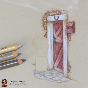
Today I want to share a mini-colouring tutorial about adding extra little details to your coloured images. I'm using the farm door stamp from the new Welcome Home set.
I began by stamping my image with light coloured ink that will virtually disappear once the colour is applied. This gives a painted, rather than stamped, look to the finished piece.
I applied a layer of medium grey pencil around the door frame, and then gradually built up the colour with lighter grey and eventually some white. Using grey, rather than white means that I've still got somewhere to go if I want to lighten (or darken) areas of the frame. Be cautious of using lots of bright white on anything. Bright white usually implies a high shine, such as you'd find on clean glass or polished metal. Very few "white" objects are actually purely white.
Similarly, the cracks in the wood have been accentuated with dark browns and reds rather than black. Always keep in mind what the item you're colouring is made from as it will help you to choose your colour palette.
When colouring doors, furniture and buildings in general, keep in mind the effects of weather and handling. For example, you might notice that I've started to accentuate the cracks in the wood at either end of the wooden beams. These are places that water would normally pool, where dust would fall and where moss and moulds would grow. I've also thought about human interaction with the object. In this case, years of handling the door bolt would have worn away the red paint, as would pushing the door open at the bottom with a foot. It's these added details that add interest to your finished piece.
Don't forget to add shadows. Little shadows on things like cracked plaster and raised bricks are virtually invisible... unless you don't add them. If I had not pointed out the fact that I've added tiny shadows throughout the brick and plaster work you wouldn't have noticed. However, if I had just coloured them without the shadows your eyes would register a completely flat wall. You'd be thinking "wall paper" instead of old bricks covered by cracking plaster.
You don't have to stop at the lines the stamp artist has given you. Use your creativity to add your own additions to the scene, being mindful of what overall feel you're trying to achieve. I've added some green pencil around the flagstones and bottom of the wall to resemble moss. That gives the viewer subconscious information about the scene, such as the weather, how much moisture is present and how often people pass through the door.
It's a good idea to keep track of the colours you're using. You'll start to learn what combinations you like, which pencils shade or highlight well and what doesn't work together.
Lastly... practise! Not everything you colour has to end up on a card, layout or other project, so just play. Colouring books are a great way to practise without feeling you need to do something with the end result, and there are lots of free digital images and colouring pages you can download from the internet and print at home. Colour the same image in a few different ways. Play with shadows and light, change the combinations just to see what happens. Enjoy!
Stamps:


GREAT tutorial! Love all the little extra hints. Yours is amazing!
ReplyDeleteWonderful coloring here - this is a fabulous stamp too! TFS your tutorial!
ReplyDeleteOh Beccy this is stunning. Thank you for all the colouring tips. I am still learning. Take care. Hugs Jackie
ReplyDeleteGorgeous, Beccy!! Fabulous coloring!!
ReplyDeleteEnjoy your sunday,
Colinda
Wonderful colouring, and thanks for the tutorial and the details you suggested
ReplyDeleteBlessings
Maxine
Beccy, thanks for this tutorial. It isn't easy to colour an image, to give that effect at it with all the shadows.
ReplyDeleteKarin.
A fantastic tutorial or advice, whichever way, it is so very useful and I know will help my colouring. Thank you.
ReplyDeleteFaith x
What a great tutorial, your image tuned out fantastic and what outstanding coloring.
ReplyDeleteThank you for sharing the tips and tricks of the coloring.
Wow, beautiful colouring the barn door looks so realistic.
ReplyDeleteBeautiful and great tutorial Beccy x
ReplyDelete