Sunday, July 28

Mimics

In the gaming world, this particular monster is known as a Mimic. It resembles a treasure chest until the moment the unwary adventurer tries to open it up! If you're a gamer, or have gamer children or grandchildren, they will most likely know all about these fierce creatures!


Digital Stamps:

Friday, July 26

Let The Games Begin


Sometimes all you need to create a great card is an interesting background, coordinating colours, and a fun image! Judy has created two CAS style cards with an awesome, adventurous vibe.


Tuesday, July 23

Choc-Orange

Just like colour combinations, there are certain flavour combinations that are considered classics, such as chocolate and orange. Mmmmmm.... Here in Australia, we have a number of popular products with the choc-orange combination. Needless to say, I'm a fan of them all!


Digital Stamps:

Sunday, July 21

Shiny Berries


Deanne has added a couple of different mediums to the coloured image on her card, including a fabulous sparkle over the raspberries and a shiny gloss on the blueberries. Along with a great shine, the mediums also add a little more texture and dimension.


Wednesday, July 17

Family Game Night


It's game night at Cynthia's place, and she has create two awesome cards to mark the occasion. She teamed two images from the Table Top Games digital set with various papers and embellishments, resulting in these fun and exciting creations! 


Tuesday, July 16

Roll With Advantage

We're big game players in our house, both electronic and table top, which means a LOT of dice! And not just your standard white cubes with six faces... we have all sorts of sizes, shapes and finishes. So after colouring my little bag of dice, it felt right to add a layer of sparkly medium to give them a magical appearance.


Digital Stamps:

Monday, July 15

Tutorial - Offset Gatefold Card


Today I have a super simple card to share. Just a couple of folds, some patterned paper, a few embellishments, and you're done! It's also easy to resize and the opening can be positioned wherever you desire... even horizontally.


1. Start with a 101/2" x 51/4" piece of cardstock. Place it horizontally on your score board and score at 35/8" and 87/8", then fold and burnish each score line.
(NOTE: You can adjust your score lines to suit whatever shape and size card you have. Just keep in mind that the combined width of the panels on either end need to equal the width of the centre panel. To create the offset, the two side panels should be different widths.)


2. To decorate, you'll need one piece of white cardstock measuring 4" x 4", one piece measuring 31/2" x 51/8", and one piece measuring 11/2" x 51/8". You'll also need a piece of patterned paper measuring 37/8" x 37/8", a coordinating piece of patterned paper measuring 33/8" x 5" and one measuring 13/8" x 5".

3. Adhere all the patterned paper to the corresponding white cardstock leaving a small border around each piece.


4. Secure the rectangular pieces of patterned paper to the two front panels of the card.


5. Secure the square piece of patterned paper to one of the front panels, centring it over the card front.


6. Decorate as desired.


Products:

Saturday, July 13

Let's Eat Cake!

A fun way to decorate a cupcake is with little spots of liquid mediums. Not only do you get fabulously bright colours, but also a nice shine and some added texture.


Digital Stamps:

Thursday, July 11


Judy has created these two sweet cupcake cards using the new Hello Cupcake set of digital stamps, some coordinating papers and cardstock, and a scattering of self-adhesive pearls. 


Wednesday, July 10

Tutorial - Muted Backgrounds


Adding a toned or muted background, before colouring an image, can help to tone down the vibrancy of colours. This is particularly useful if you want an aged or vintage look.


Start by adding a background of light grey, warm if you want a warm tone to your project, and cool if you'd prefer cooler colours. Apply the ink in small, cross-hatched sections leaving lots of texture.


Apply some splotches of the same ink in various places around the background, trying to avoid the image if possible. You can either drop the ink from a height to create a splatter effect or apply it with a ball tool if you prefer a little more control.


Give the page a light spritz of clear alcohol for more texture.


Add some darker ink around the edges of the panel to give it an aged look.


Add a shadow beneath the image using darker shades of warm grey to help tie it in to the background and anchor the character to the environment (grounding).


Now colour the image as you would normally, disregarding all of the ink you placed in the background.


If you find a colour is too vibrant, simply add another layer or two of the greys you used in the background, which is what I did to tone down the red on the dwarf's shield.


Digital Stamps:

Sunday, July 7

Monochrome


Deanne combined grey and dark blue cardstock to create this wonderful monochromatic card. She applied a coat of Glossy Accents to the dice to make them extra shiny and finished the project with a piece of dark blue twine.


Saturday, July 6

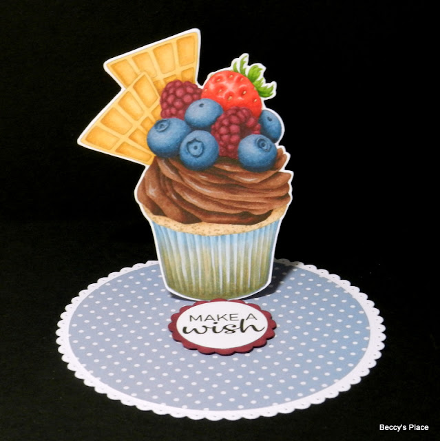
Cupcake Easel Card

Easel cards are probably my favourite type of fancy fold. They look fabulous, are relatively simple to make and can be altered to suit just about any image, shape or size, such as this cupcake.


I took a bit of time to carefully position my cupcake so it didn't overhang the edges of the card when folded. I also wanted it to look good when it first comes out of the envelope so I added a little of the patterned paper onto the easel section to try to camouflage it as much as possible. 


Digital Stamps: